SwiftUI – TextField Placeholder
In SwiftUI, a TextField is a UI component used to accept text input from the user. A placeholder is a string displayed inside the TextField when it is empty, serving as a hint or guide for the user about what information to enter.
SwiftUI makes it easy to add placeholders to TextField components using the first parameter of the initializer.
In this SwiftUI tutorial, we will show you how to add placeholders to a TextField and customise them further.
Basic Syntax for TextField Placeholder
The basic syntax for creating a TextField with a placeholder is:
TextField("Placeholder Text", text: $bindingVariable)Here:
"Placeholder Text": The placeholder string that appears when theTextFieldis empty.text: $bindingVariable: A binding to a state variable that stores the user’s input.
By default, the placeholder text disappears as the user starts typing.
Examples
Let’s explore how to use placeholders in TextField with examples.
Example 1: Simple TextField with Placeholder
This example demonstrates a basic TextField with a placeholder:
Code Example:
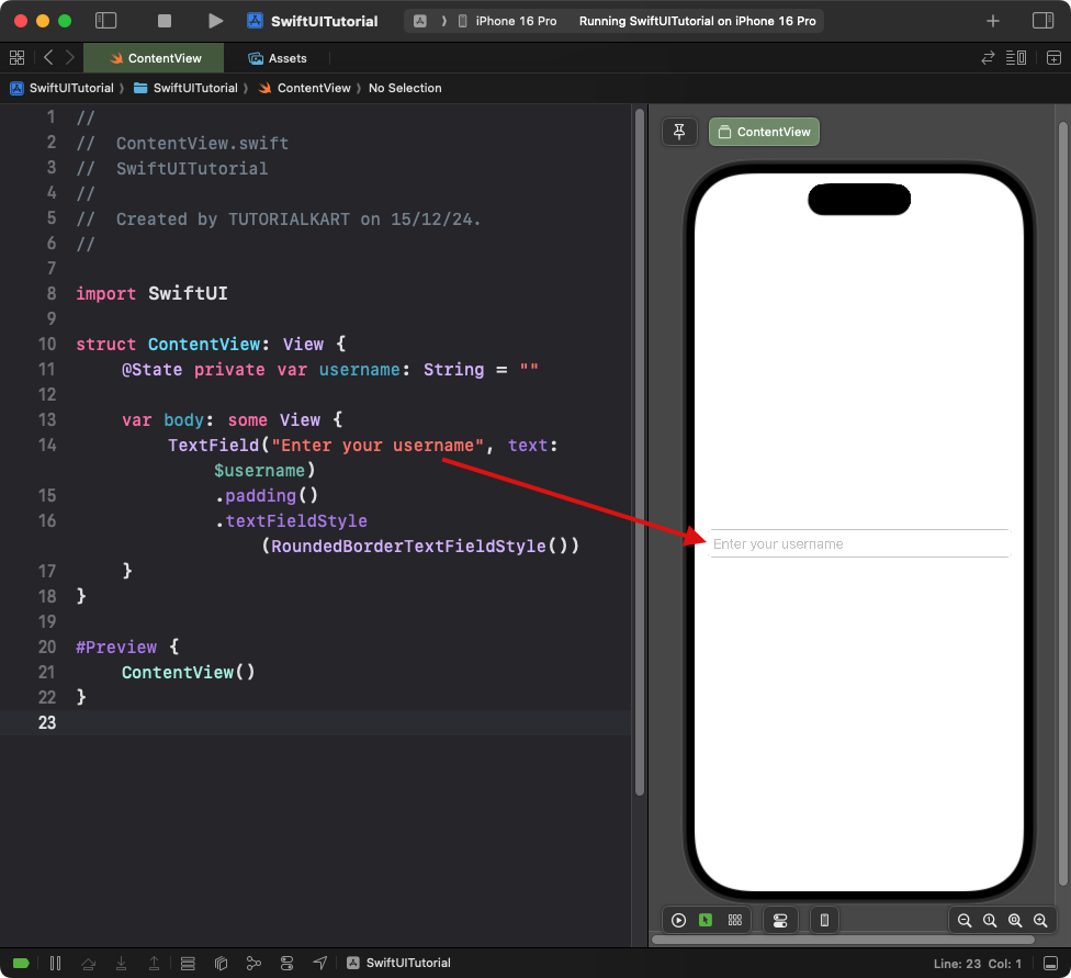
import SwiftUI

struct ContentView: View {
    @State private var username: String = ""

    var body: some View {
        TextField("Enter your username", text: $username)
            .padding()
            .textFieldStyle(RoundedBorderTextFieldStyle())
    }
}
Explanation:
- The
TextFielddisplays “Enter your username” as the placeholder text. - The
usernamestate variable stores the user’s input. - The
.textFieldStyle(RoundedBorderTextFieldStyle())modifier adds a rounded border to theTextField.
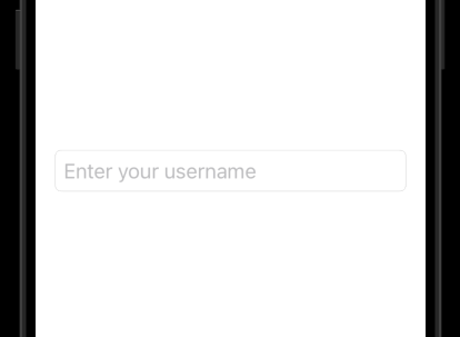
Result: A text field with placeholder text “Enter your username” and a rounded border appears.
Example 2: Custom Placeholder Style
To customise the appearance of the placeholder, wrap the TextField inside a ZStack and use a conditional view:
Code Example:
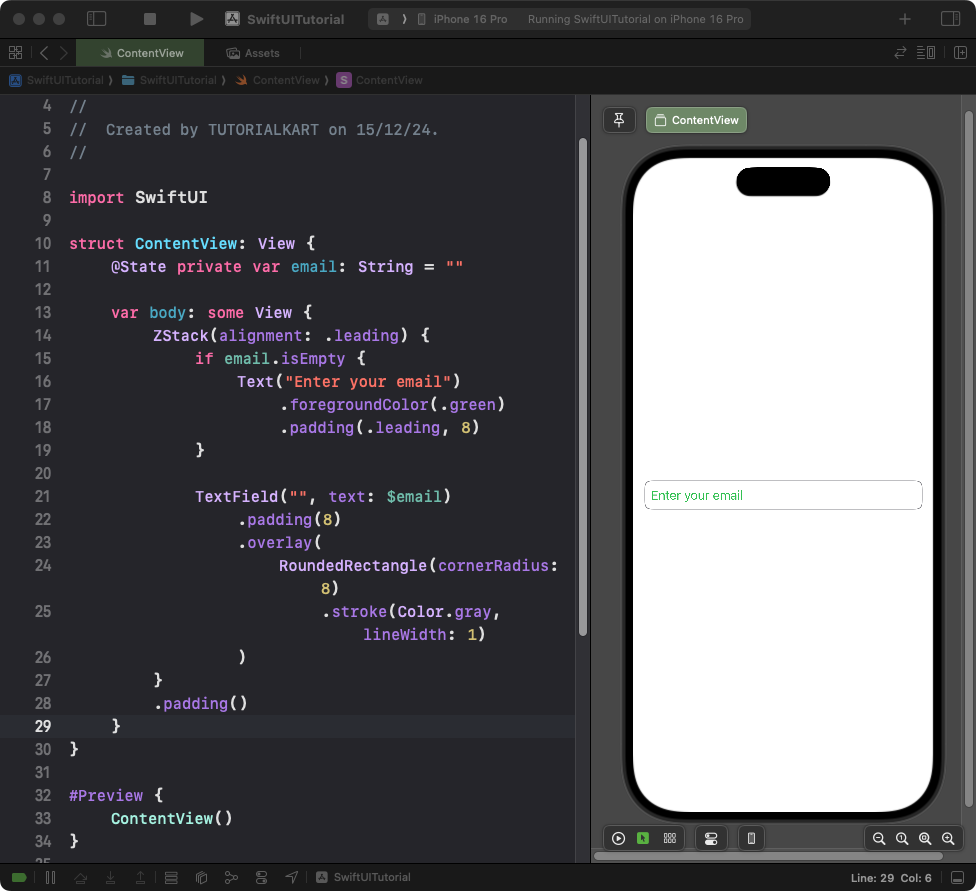
import SwiftUI

struct ContentView: View {
    @State private var email: String = ""

    var body: some View {
        ZStack(alignment: .leading) {
            if email.isEmpty {
                Text("Enter your email")
                    .foregroundColor(.green)
                    .padding(.leading, 8)
            }

            TextField("", text: $email)
                .padding(8)
                .overlay(
                    RoundedRectangle(cornerRadius: 8)
                        .stroke(Color.gray, lineWidth: 1)
                )
        }
        .padding()
    }
}
Explanation:
- The
ZStackplaces the placeholder text and theTextFieldin the same position. - The placeholder appears only when the
emailvariable is empty. - The
.overlay()modifier adds a rounded rectangle border around theTextField.
Result: A text field with custom-styled placeholder text “Enter your email” and a gray border appears.
Conclusion
Adding and customizing placeholders in SwiftUI TextField is straightforward and highly flexible. Whether using the default placeholder or creating a custom style, you can guide users effectively on what to input in your app’s forms.