SwiftUI – TextField Placeholder Animation
In SwiftUI, a TextField placeholder provides a helpful hint about the expected input. Adding animations to the placeholder can enhance the user experience by making the UI more dynamic and intuitive. For example, you can animate the placeholder to move above the TextField when the user starts typing.
In this SwiftUI tutorial, we will show you how to create an animated placeholder for a TextField using SwiftUI.
Animating Placeholder in SwiftUI
To animate the placeholder, you can use a ZStack to layer the placeholder and TextField. Use a state variable to track whether the TextField is focused and apply SwiftUI animations to the placeholder’s position, scale, or opacity based on this state.
Basic Syntax
The general approach is:
ZStack(alignment: .leading) {
    Text("Placeholder Text")
        .scaleEffect(isFocused || !boundVariable.isEmpty ? 0.8 : 1.0)
        .offset(y: isFocused || !boundVariable.isEmpty ? -20 : 0)
        .animation(.easeInOut, value: isFocused || !boundVariable.isEmpty)

    TextField("", text: $boundVariable, onEditingChanged: { focused in
        isFocused = focused
    })
}
Here:
isFocused: A state variable to track whether theTextFieldis focused.scaleEffect: Animates the size of the placeholder.offset: Animates the position of the placeholder.animation: Specifies the type of animation to apply.
Examples
Let’s explore an example of animating the placeholder for a TextField in SwiftUI.
Example 1: Animated Placeholder
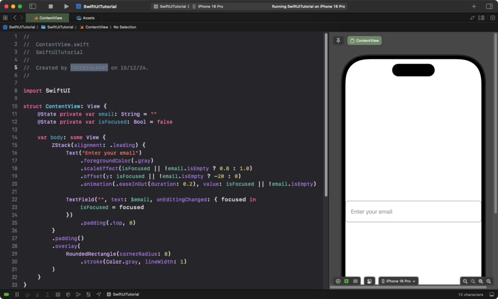
This example demonstrates how to animate the placeholder to move and shrink when the user starts typing:
Code Example:
import SwiftUI

struct ContentView: View {
    @State private var email: String = ""
    @State private var isFocused: Bool = false

    var body: some View {
        ZStack(alignment: .leading) {
            Text("Enter your email")
                .foregroundColor(.gray)
                .scaleEffect(isFocused || !email.isEmpty ? 0.8 : 1.0) // Shrink when typing or focused
                .offset(y: isFocused || !email.isEmpty ? -20 : 0)    // Move up when typing or focused
                .animation(.easeInOut(duration: 0.2), value: isFocused || !email.isEmpty)

            TextField("", text: $email, onEditingChanged: { focused in
                isFocused = focused
            })
                .padding(.top, 8)
        }
        .padding()
        .overlay(
            RoundedRectangle(cornerRadius: 8)
                .stroke(Color.gray, lineWidth: 1)
        )
    }
}
Explanation:
- The placeholder text “Enter your email” shrinks and moves up when the
TextFieldis focused or contains text. isFocusedtracks the focus state of theTextField.animation(.easeInOut)creates a smooth transition for the placeholder’s scale and position changes.- The
.overlay()modifier adds a border around theTextFieldfor better visual distinction.
Result: The placeholder animates smoothly when the user starts typing or when the text field gains focus.
Example 2: Reusable Animated Placeholder TextField
To make the animated placeholder reusable, you can create a custom view:
Code Example:
import SwiftUI

struct AnimatedPlaceholderTextField: View {
    var placeholder: String
    @Binding var text: String
    @State private var isFocused: Bool = false

    var body: some View {
        ZStack(alignment: .leading) {
            Text(placeholder)
                .foregroundColor(.gray)
                .scaleEffect(isFocused || !text.isEmpty ? 0.8 : 1.0)
                .offset(y: isFocused || !text.isEmpty ? -20 : 0)
                .animation(.easeInOut(duration: 0.2), value: isFocused || !text.isEmpty)

            TextField("", text: $text, onEditingChanged: { focused in
                isFocused = focused
            })
                .padding(.top, 8)
        }
        .padding()
        .overlay(
            RoundedRectangle(cornerRadius: 8)
                .stroke(Color.gray, lineWidth: 1)
        )
    }
}

struct ContentView: View {
    @State private var username: String = ""

    var body: some View {
        AnimatedPlaceholderTextField(placeholder: "Enter your username", text: $username)
            .padding()
    }
}
Explanation:
- The
AnimatedPlaceholderTextFieldcomponent accepts a placeholder string and a binding for the text input. - The animation logic is encapsulated in the reusable component.
- You can reuse this view in multiple places with different placeholders and bindings.
Result: A reusable animated text field with a custom placeholder is created.
Conclusion
Animating a placeholder in SwiftUI enhances the user experience by providing a smooth and intuitive interaction. By combining ZStack, conditional views, and animations, you can create dynamic placeholders for your TextField components. Using reusable components makes it easy to maintain consistency across your app.
