SwiftUI – TextField Placeholder Size
In SwiftUI, the TextField allows you to display a placeholder that guides users about the input to be entered. By default, the placeholder text inherits the styling of the system font and size. To customize the placeholder size, you can use a ZStack and conditionally display the placeholder as a separate Text view with custom font styling.

In this SwiftUI tutorial, we will go through how to customise the size of the placeholder in a SwiftUI TextField with practical examples.
Customizing Placeholder Size
SwiftUI does not directly provide a modifier to adjust the placeholder size of a TextField. However, you can achieve this by overlaying a Text view as a placeholder and controlling its size using the .font() modifier.
Basic Syntax
The general syntax for customizing placeholder size is:
ZStack(alignment: .leading) {
    if boundVariable.isEmpty {
        Text("Placeholder Text")
            .font(.system(size: customSize))
    }
    TextField("", text: $boundVariable)
}
Here:
boundVariable: A state variable that holds the user’s input.Text("Placeholder Text"): The placeholder text styled with a custom font size..font(.system(size: customSize)): Sets the font size of the placeholder text.ZStack: Ensures the placeholder text andTextFieldare overlaid in the same position.
Examples
Let’s explore examples of how to customize placeholder size in SwiftUI.
Example 1: Custom Placeholder Font Size
This example demonstrates how to set a custom font size for the placeholder:
Code Example:
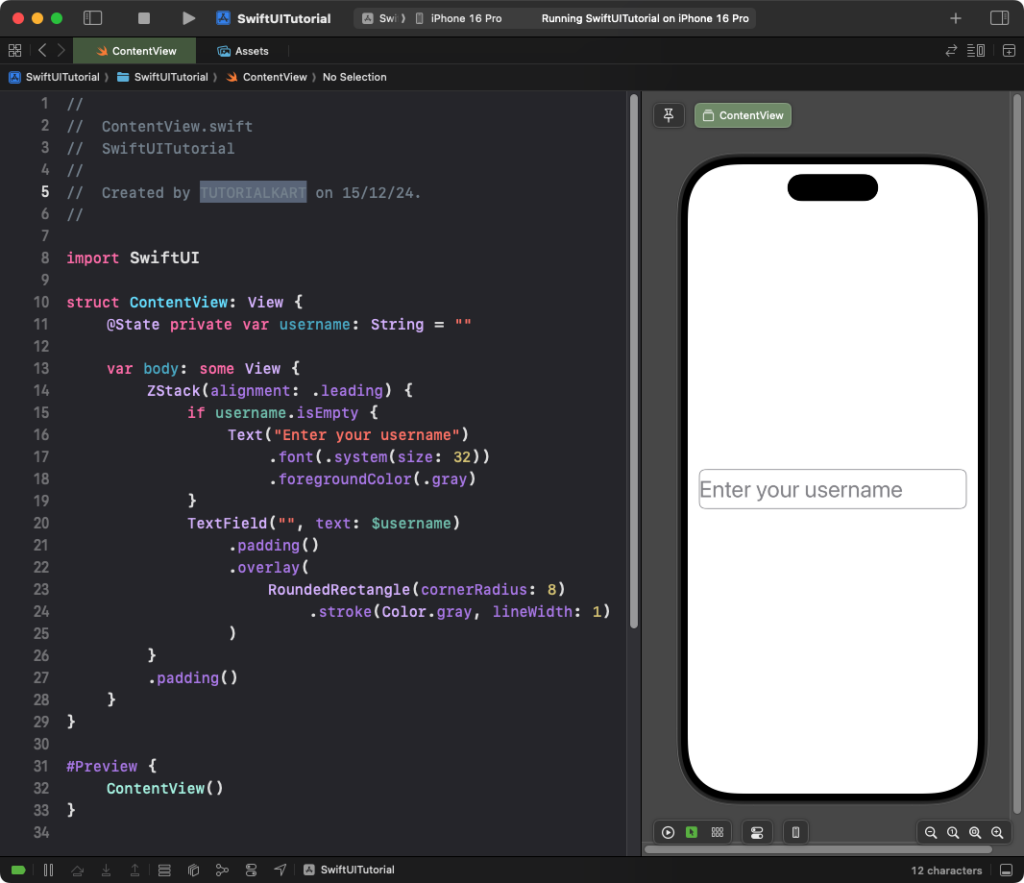
import SwiftUI

struct ContentView: View {
    @State private var username: String = ""

    var body: some View {
        ZStack(alignment: .leading) {
            if username.isEmpty {
                Text("Enter your username")
                    .font(.system(size: 32)) // Custom placeholder font size
                    .foregroundColor(.gray)
            }
            TextField("", text: $username)
                .padding()
                .overlay(
                    RoundedRectangle(cornerRadius: 8)
                        .stroke(Color.gray, lineWidth: 1)
                )
        }
        .padding()
    }
}
Explanation:
- The placeholder text “Enter your username” is displayed with a custom font size of 32 points using
.font(.system(size: 32)). - The
ZStackoverlays the placeholder text on theTextField. - The placeholder text disappears when the user starts typing.
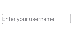
Result: A text field with a custom-sized placeholder appears.
Example 2: Reusable Placeholder Component
You can create a reusable component for a TextField with customizable placeholder size:
Code Example:
import SwiftUI

struct PlaceholderTextField: View {
    var placeholder: String
    @Binding var text: String
    var fontSize: CGFloat = 16
    var placeholderColor: Color = .gray

    var body: some View {
        ZStack(alignment: .leading) {
            if text.isEmpty {
                Text(placeholder)
                    .font(.system(size: fontSize)) // Set placeholder font size
                    .foregroundColor(placeholderColor)
                    .padding(.leading, 8)
            }
            TextField("", text: $text)
                .padding(8)
                .overlay(
                    RoundedRectangle(cornerRadius: 8)
                        .stroke(Color.gray, lineWidth: 1)
                )
        }
    }
}

struct ContentView: View {
    @State private var email: String = ""

    var body: some View {
        PlaceholderTextField(
            placeholder: "Enter your email",
            text: $email,
            fontSize: 20 // Custom font size for placeholder
        )
        .padding()
    }
}
Explanation:
PlaceholderTextFieldis a reusable view that accepts parameters for the placeholder text, font size, and placeholder color.- The placeholder text size is customized using the
fontSizeparameter. - The placeholder disappears when the user starts typing.
Result: A reusable text field with a custom placeholder size appears.
Conclusion
While SwiftUI does not provide a direct way to customize placeholder size, using a ZStack and overlaying a styled Text view offers a flexible solution. By creating reusable components, you can efficiently manage placeholder sizes across your app.
