SwiftUI – Toggle Color
In SwiftUI, a Toggle is a control that switches between on and off states.
By default, SwiftUI provides a standard appearance for toggles. However, you can customise their colors to align with your app’s design using modifiers like tint, .foregroundColor(), and other styling techniques.
This tutorial demonstrates how to customise the color of a Toggle in SwiftUI with practical examples.
Customizing Toggle Colors
To change the color of a Toggle, you can:
- Use the
tintModifier: Change the toggle’s accent color (used for the active state). - Customize Labels: Use
.foregroundColor()or other modifiers to style the label text or images. - Combine with Containers: Apply background colors to the toggle’s container for additional styling.
Let’s explore these approaches in detail with examples.
Examples
Example 1: Changing the Toggle Tint Color
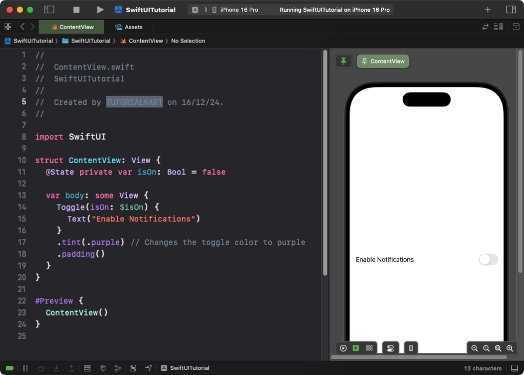
This example demonstrates how to use the tint modifier to change the toggle’s accent color:
Code Example:
import SwiftUI

struct ContentView: View {
    @State private var isOn: Bool = false

    var body: some View {
        Toggle(isOn: $isOn) {
            Text("Enable Notifications")
        }
        .tint(.purple) // Changes the toggle color to purple
        .padding()
    }
}
Explanation:
- The
.tint(.purple)modifier changes the toggle’s active state color to purple. - The label
Text("Enable Notifications")remains styled by default.
Result: A toggle with a purple accent color is displayed.
Example 2: Customising Toggle Label Colors
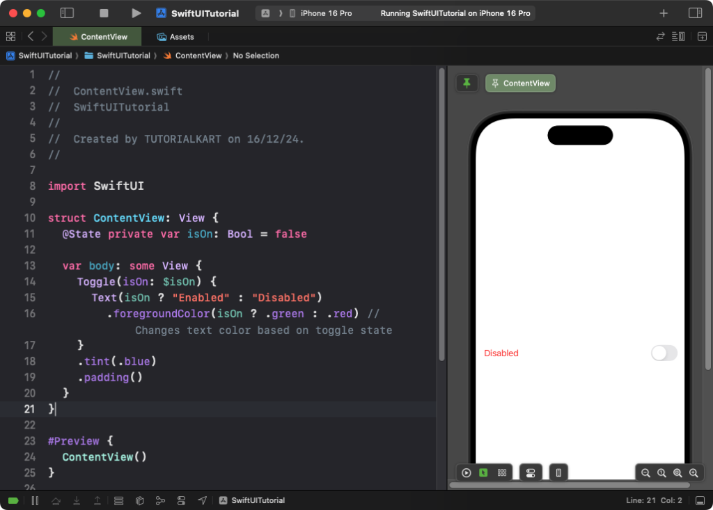
This example changes the color of the toggle’s label based on its state:
Code Example:
import SwiftUI

struct ContentView: View {
    @State private var isOn: Bool = false

    var body: some View {
        Toggle(isOn: $isOn) {
            Text(isOn ? "Enabled" : "Disabled")
                .foregroundColor(isOn ? .green : .red) // Changes text color based on toggle state
        }
        .tint(.blue)
        .padding()
    }
}
Explanation:
- The
Textdynamically changes its color to green when the toggle is on and red when it’s off. - The toggle’s active color is set to blue using the
.tint()modifier.
Result: A toggle with a blue accent color and a dynamic label that changes its color based on the toggle’s state.
Example 3: Toggle with a Custom Background
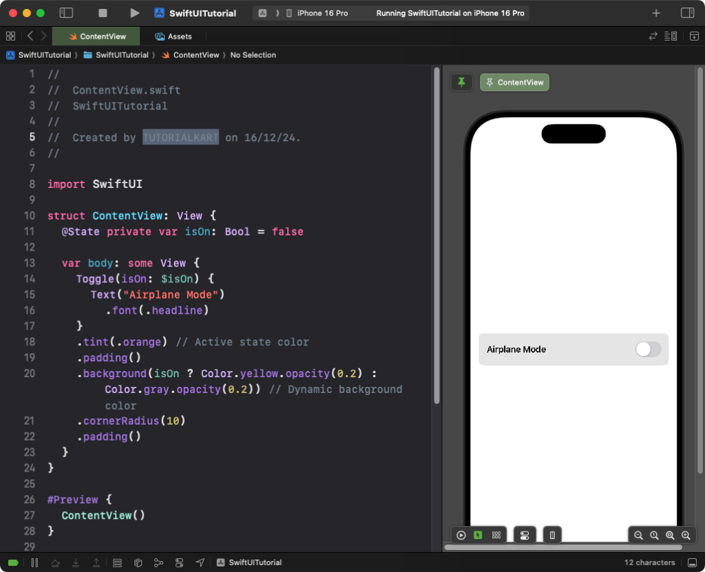
This example places the toggle in a custom container with a background color:
Code Example:
import SwiftUI

struct ContentView: View {
    @State private var isOn: Bool = false

    var body: some View {
        Toggle(isOn: $isOn) {
            Text("Airplane Mode")
                .font(.headline)
        }
        .tint(.orange) // Active state color
        .padding()
        .background(isOn ? Color.yellow.opacity(0.2) : Color.gray.opacity(0.2)) // Dynamic background color
        .cornerRadius(10)
        .padding()
    }
}
Explanation:
- The toggle’s container background dynamically changes based on its state: yellow when on and gray when off.
- The
.tint(.orange)modifier sets the toggle’s active state color to orange. - The
.cornerRadius(10)gives the container rounded corners.
Result: A toggle styled with a dynamic background and rounded corners appears.
Example 4: Combining Images and Colors
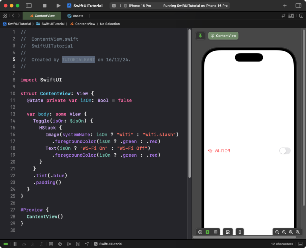
This example combines an image and dynamic color for a visually enhanced toggle:
Code Example:
import SwiftUI

struct ContentView: View {
    @State private var isOn: Bool = false

    var body: some View {
        Toggle(isOn: $isOn) {
            HStack {
                Image(systemName: isOn ? "wifi" : "wifi.slash")
                    .foregroundColor(isOn ? .green : .red)
                Text(isOn ? "Wi-Fi On" : "Wi-Fi Off")
                    .foregroundColor(isOn ? .green : .red)
            }
        }
        .tint(.blue)
        .padding()
    }
}
Explanation:
- The
Imagedynamically switches between a Wi-Fi icon and a disabled Wi-Fi icon based on the toggle’s state. - The label text and icon color change to green when the toggle is on and red when it’s off.
- The
.tint(.blue)modifier sets the toggle’s active state to blue.
Result: A toggle with dynamic colors, a Wi-Fi icon, and descriptive text is displayed.
Conclusion
SwiftUI provides powerful tools to customize toggle colors using the .tint() modifier, dynamic backgrounds, and label styling. By combining these techniques, you can create toggles that enhance your app’s visual design and provide clear feedback to users.
