SwiftUI – Toggle Size
In SwiftUI, a Toggle control is used to manage on/off states. By default, the size of a toggle is determined by the system, but you can customize its size using modifiers such as .frame(), .scaleEffect(), or by styling its container.
This tutorial demonstrates how to adjust and customise the size of a toggle in SwiftUI with practical examples.
Customizing Toggle Size
To customize the size of a Toggle, you can:
- Use the
.frame()Modifier: Set the width and height of the toggle container. - Apply
.scaleEffect(): Scale the toggle proportionally. - Combine with Containers: Use a HStack, VStack, or ZStack to position and style the toggle.
Let’s explore these approaches with examples.
Examples
Below are examples of customising the size of a toggle in SwiftUI.
Example 1: Adjusting Toggle Size with .frame()
This example demonstrates how to use the .frame() modifier to set the container size for a toggle:
Code Example:
import SwiftUI
struct ContentView: View {
@State private var isOn: Bool = false
var body: some View {
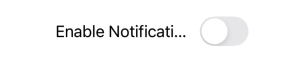
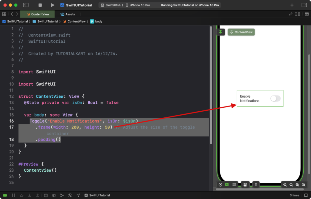
Toggle("Enable Notifications", isOn: $isOn)
.frame(width: 200, height: 50) // Adjust the size of the toggle container
.padding()
}
}
Explanation:
- The
.frame(width: 200, height: 50)sets the size of the toggle’s container. - The toggle automatically aligns itself within the specified frame dimensions.
Result: A toggle with a larger container is displayed, providing more visual space around it.
Example 2: Scaling the Toggle with .scaleEffect()
This example uses the .scaleEffect() modifier to resize the toggle proportionally:
Code Example:
import SwiftUI
struct ContentView: View {
@State private var isOn: Bool = false
var body: some View {
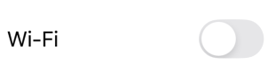
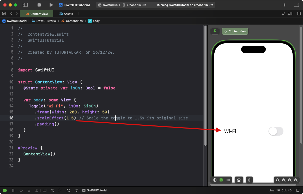
Toggle("Wi-Fi", isOn: $isOn)
.frame(width: 200, height: 50)
.scaleEffect(1.5) // Scale the toggle to 1.5x its original size
.padding()
}
}
Explanation:
- The
.scaleEffect(1.5)enlarges the toggle to 1.5 times its default size. - The scaling applies proportionally to both width and height, maintaining the toggle’s aspect ratio.
Result: A larger toggle appears on the screen while maintaining its original proportions.
Example 3: Combining Toggle Size Customisation with Containers
This example positions a resized toggle within a custom-styled container:
Code Example:
import SwiftUI

struct ContentView: View {
    @State private var isOn: Bool = false

    var body: some View {
        VStack {
            Toggle(isOn: $isOn) {
                Text("Airplane Mode")
                    .font(.headline)
            }
            .scaleEffect(1.2) // Resize the toggle
            .padding()
            .background(Color.gray.opacity(0.2)) // Add background to the container
            .cornerRadius(10)
            .frame(width: 250, height: 60) // Set fixed size for the container
        }
        .padding()
    }
}
Explanation:
- The
.scaleEffect(1.2)enlarges the toggle by 1.2 times its original size. - The
.frame(width: 250, height: 60)sets a fixed size for the toggle’s container. - The
.background()and.cornerRadius()add a custom background with rounded corners to the container.
Result: A resized toggle is displayed within a styled container.
Conclusion
SwiftUI provides flexible tools to adjust the size of a Toggle. Whether you need a larger toggle, a toggle within a styled container, or a full-width toggle, modifiers like .frame(), .scaleEffect(), and containers allow you to create visually appealing and functional designs tailored to your app’s needs.