SwiftUI – Toggle with Image
In SwiftUI, a Toggle is a switch-like control used to manage on/off states. You can enhance its visual appeal by incorporating images into the toggle, either as labels or as part of its design. Using images makes the toggle more intuitive and visually engaging for users.
This tutorial demonstrates how to create and customise a toggle with images in SwiftUI using practical examples.
Adding Images to a Toggle
In SwiftUI, you can combine a Toggle with an image by:
- Using an image as the label for the toggle.
- Changing the appearance of the toggle based on its state.
- Combining text and images for a richer user interface.
Let’s explore these approaches with examples.
Examples
Example 1: Toggle with an Image Label
This example demonstrates a toggle with an image as its label:
Code Example:
import SwiftUI

struct ContentView: View {
    @State private var isOn: Bool = false

    var body: some View {
        Toggle(isOn: $isOn) {
            Image(systemName: isOn ? "sun.max.fill" : "moon.fill")
                .foregroundColor(isOn ? .yellow : .blue)
                .font(.largeTitle)
        }
        .padding()
    }
}
Explanation:
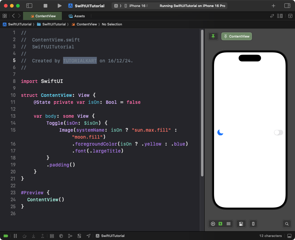
- The
Imageview acts as the label for the toggle. - The image changes dynamically between a sun and a moon icon based on the toggle’s state.
- The color of the image also changes: yellow when on and blue when off.
Result: A toggle with a dynamic image label representing day and night states.
Example 2: Toggle with Text and Image
This example adds both text and an image to the toggle label:
Code Example:
import SwiftUI

struct ContentView: View {
    @State private var isOn: Bool = false

    var body: some View {
        Toggle(isOn: $isOn) {
            HStack {
                Image(systemName: isOn ? "wifi" : "wifi.slash")
                    .foregroundColor(isOn ? .green : .red)
                Text(isOn ? "Wi-Fi Enabled" : "Wi-Fi Disabled")
                    .foregroundColor(isOn ? .green : .red)
            }
        }
        .padding()
    }
}
Explanation:
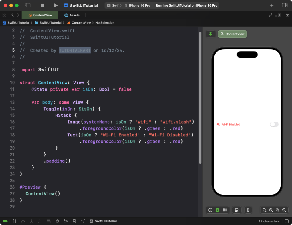
- The
HStackarranges the image and text horizontally. - The image changes dynamically between a Wi-Fi icon and a disabled Wi-Fi icon based on the toggle’s state.
- The text also updates to reflect the current state of the toggle (enabled/disabled).
- The colors of both the text and image change dynamically: green when on and red when off.
Result: A toggle with a dynamic label that combines text and an image to represent Wi-Fi status.
Example 3: Custom Toggle Style with Image
This example demonstrates a custom toggle style where the toggle itself appears as an image:
Code Example:
import SwiftUI

struct ContentView: View {
    @State private var isOn: Bool = false

    var body: some View {
        Toggle("", isOn: $isOn)
            .toggleStyle(SwitchToggleStyle(tint: .orange))
            .overlay(
                Image(systemName: isOn ? "lock.open.fill" : "lock.fill")
                    .font(.largeTitle)
                    .foregroundColor(isOn ? .green : .red)
                    .padding(.trailing, 40), alignment: .leading
            )
            .padding()
    }
}
Explanation:
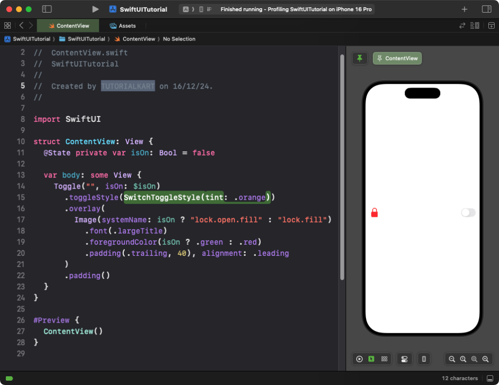
- The
SwitchToggleStyleis used to style the toggle with a custom orange tint. - An
Imageis overlaid on the toggle using the.overlay()modifier. - The image dynamically changes between a locked and unlocked icon based on the toggle’s state.
- The color of the icon changes to green when on and red when off.
Result: A custom toggle styled with a dynamic lock/unlock image.
Conclusion
By combining SwiftUI’s Toggle with images, you can create visually engaging and intuitive controls for your app. Whether you use images as labels, dynamic visual indicators, or part of a custom style, toggles with images improve usability and align with modern design standards.
References:
