Android Jetpack Compose – Card
Android Jetpack Card composable is used to display its content on a raised surface.
We can set the elevation and other styling for this Card composable.
ADVERTISEMENT
Example
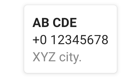
In this example, we shall display a Column composable wrapped in a Card composable. We shall set the elevation to 4 dp.
Create a Project in Android Studio with Empty Compose Activity template, and modify MainActivity.kt file as shown in the following.
MainActivity.kt
package com.example.myapplication
import android.os.Bundle
import androidx.activity.compose.setContent
import androidx.appcompat.app.AppCompatActivity
import androidx.compose.foundation.layout.Column
import androidx.compose.foundation.layout.fillMaxHeight
import androidx.compose.foundation.layout.fillMaxWidth
import androidx.compose.foundation.layout.padding
import androidx.compose.material.Card
import androidx.compose.material.Text
import androidx.compose.ui.Alignment
import androidx.compose.ui.Modifier
import androidx.compose.ui.graphics.Color
import androidx.compose.ui.text.font.FontWeight
import androidx.compose.ui.unit.dp
import com.example.myapplication.ui.theme.MyApplicationTheme
class MainActivity : AppCompatActivity() {
override fun onCreate(savedInstanceState: Bundle?) {
super.onCreate(savedInstanceState)
setContent {
MyApplicationTheme {
Column(
horizontalAlignment = Alignment.CenterHorizontally,
modifier = Modifier.fillMaxWidth().fillMaxHeight(), content = {
Card(elevation = 4.dp, modifier = Modifier.padding(all = 10.dp)) {
Column(modifier = Modifier.padding(all = 10.dp)) {
Text("AB CDE", fontWeight = FontWeight.W700)
Text("+0 12345678")
Text("XYZ city.", color = Color.Gray)
}
}
}
)
}
}
}
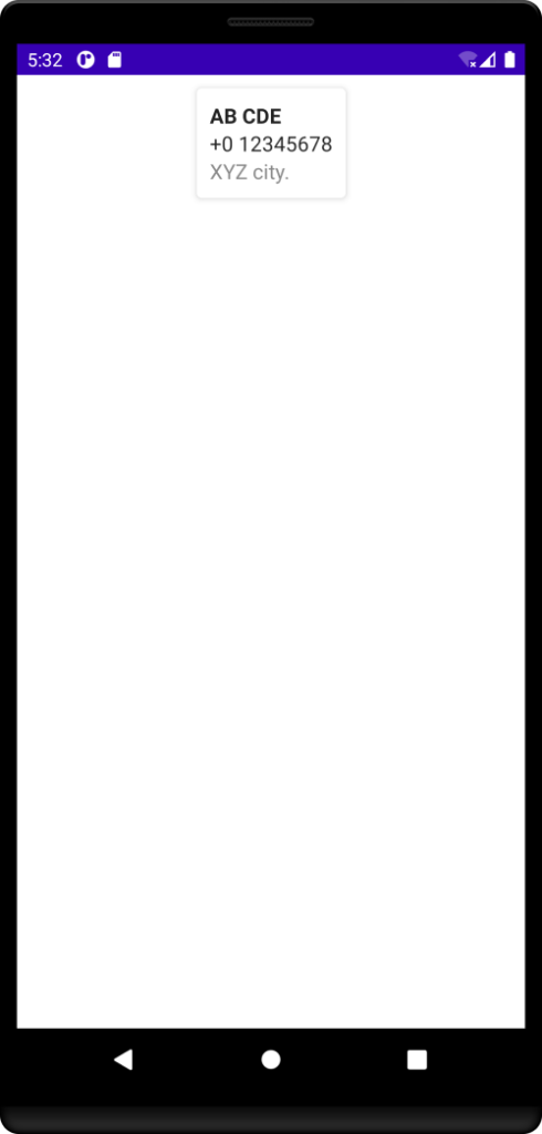
} Screenshot
Conclusion
In this Android Jetpack Compose Tutorial, we learned what Card composable is, and how to style the Card composable, with the help of individual tutorials for each concept.