 TutorialKart.com
Matplotlib is a Python data visualization library used to create line charts, scatter plots, bar graphs, histograms, pie charts, and many other types of figures. It is commonly used with NumPy, pandas, Jupyter Notebook, and other Python data-analysis tools.
The matplotlib.pyplot module provides a convenient plotting interface. It contains functions for creating figures, plotting data, adding titles and labels, formatting axes, displaying legends, arranging subplots, and saving charts as image files.
Matplotlib Tutorial for Python Beginners
In this Matplotlib tutorial, you will learn how to install the library, create a basic plot, understand figures and axes, customize chart elements, display multiple plots, and save a completed visualization. The examples then demonstrate scatter plots, bar graphs, histograms, and pie charts.
Data visualization converts numerical or categorical data into a visual form that is easier to inspect. A suitable chart can help reveal changes over time, differences between categories, distributions, clusters, unusual values, and relationships between variables.
Install Matplotlib with pip or Conda
Matplotlib must be installed in the Python environment where the program or notebook will run. Install it with pip using the following command:
python -m pip install matplotlibWhen using Anaconda or Miniconda, you can install Matplotlib with Conda:
conda install matplotlibVerify that the package can be imported and check its installed version:
import matplotlib

print(matplotlib.__version__)
If an editor reports ModuleNotFoundError: No module named 'matplotlib', confirm that Matplotlib was installed with the same Python interpreter selected by the editor or notebook kernel.
Import matplotlib.pyplot and Understand the Plotting Interface
Matplotlib is usually imported with the conventional alias plt:
import matplotlib.pyplot as pltA Matplotlib visualization is organized around two important objects:
- Figure: the complete drawing area that can contain one or more plots.
- Axes: an individual plotting area containing the data, axis ticks, labels, title, and legend.
Short scripts often call functions such as plt.plot() directly. For larger programs, the object-oriented interface based on Figure and Axes objects generally makes multiple charts and detailed formatting easier to manage.
Matplotlib Plot Types and Their Uses
Choose a plot type according to the structure of the data and the comparison you need to make:
- Line plot: shows changes across an ordered sequence, such as time.
- Scatter plot: shows the relationship between two numerical variables.
- Bar graph: compares values across categories.
- Histogram: groups numerical observations into intervals to show their distribution.
- Pie chart: shows parts of a whole when there are only a few clearly distinguishable categories.
- Area plot: emphasizes cumulative magnitude or change over an ordered axis.
- Hexagonal bin plot: summarizes dense two-dimensional numerical data where points would overlap heavily.
Create a Basic Matplotlib Line Plot
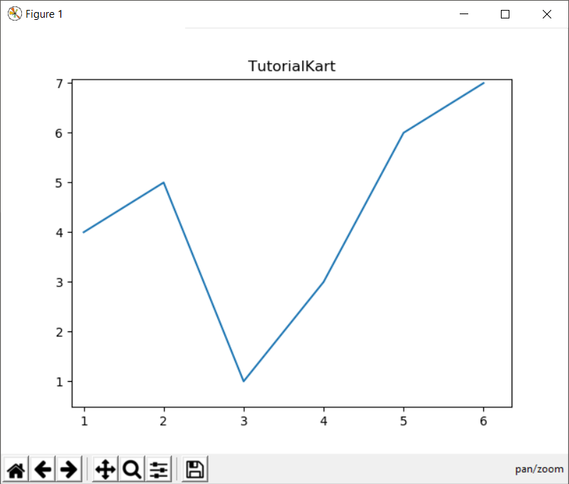
The following example passes a sequence of x-values and a corresponding sequence of y-values to plot(). Both sequences must contain the same number of items.
example.py
import matplotlib.pyplot as pyplot

pyplot.plot([1, 2, 3, 4, 5, 6],[4, 5, 1, 3, 6, 7])
pyplot.title('TutorialKart')
pyplot.show()
The first argument to plot(), [1, 2, 3, 4, 5, 6], supplies the horizontal x-coordinates. The second argument, [4, 5, 1, 3, 6, 7], supplies the vertical y-coordinates. Matplotlib joins the corresponding data points with a line.
The pyplot.title() function sets the chart title. The pyplot.show() function renders the figure. Depending on the environment and selected backend, the figure may appear inline in a notebook or in a separate interactive window with controls for zooming, panning, configuring subplots, and saving the chart.
Add Axis Labels, Markers, Grid Lines, and a Legend
A readable chart should identify the measured values and provide enough context to interpret them. This example uses the object-oriented Matplotlib interface and customizes the line without changing the underlying data.
import matplotlib.pyplot as plt

months = [1, 2, 3, 4, 5, 6]
sales = [42, 48, 45, 55, 61, 68]

fig, ax = plt.subplots(figsize=(8, 4.5))
ax.plot(months, sales, marker='o', linewidth=2, label='Monthly sales')
ax.set_title('Sales During the First Six Months')
ax.set_xlabel('Month number')
ax.set_ylabel('Units sold')
ax.set_xticks(months)
ax.grid(True, alpha=0.3)
ax.legend()

fig.tight_layout()
plt.show()
plt.subplots() returns a figure and an axes object. Methods such as set_title(), set_xlabel(), and set_ylabel() modify that axes. The tight_layout() call adjusts spacing so that labels are less likely to be clipped.
Create a Matplotlib Scatter Plot
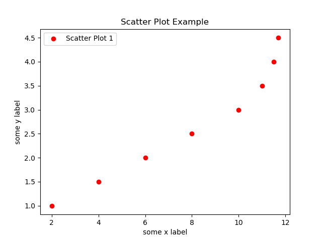
A scatter plot uses Cartesian coordinates to display paired values for two numerical variables. Each point represents one pair of x and y observations. Use matplotlib.pyplot.scatter() to create the plot.
example.py
import matplotlib.pyplot as pyplot

# data
a = [2,4,6,8,10,11,11.5,11.7]
b = [1,1.5,2,2.5,3,3.5,4,4.5]

# matplotlib plot
pyplot.scatter(a,b,label='Scatter Plot 1',color='r')
pyplot.xlabel('some x label')
pyplot.ylabel('some y label')
pyplot.title('Scatter Plot Example')
pyplot.legend()
pyplot.show()
Here, the values at matching positions in a and b form coordinate pairs. For example, the first point is (2, 1), and the second point is (4, 1.5). The label is displayed when legend() is called.
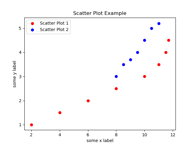
Multiple scatter datasets can be drawn on the same axes by calling scatter() once for each dataset. Use distinct labels and visual properties so that the groups can be identified.
example.py
import matplotlib.pyplot as pyplot

# data
a = [2,4,6,8,10,11,11.5,11.7]
b = [1,1.5,2,2.5,3,3.5,4,4.5]
ab=[8,8.5,9,9.5,10,10.5,11]
cd=[3,3.5,3.7,4,4.5,5,5.2]

# matplotlib plot
pyplot.scatter(a,b,label='Scatter Plot 1',color='r')
pyplot.scatter(ab,cd,label='Scatter Plot 2',color='b')
pyplot.xlabel('some x label')
pyplot.ylabel('some y label')
pyplot.title('Scatter Plot Example')
pyplot.legend()
pyplot.show()
This example places two scatter datasets on one plotting area. The legend associates each label with its corresponding group of points.
Create a Matplotlib Bar Graph for Categorical Data
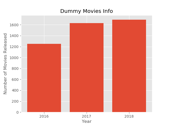
A bar graph compares numerical values associated with discrete categories. The length or height of each bar represents the corresponding value.
In the following example, years are used as categories and the number of movies released is used as the value for each category. The pyplot.bar() function draws the bars.
example.py
from matplotlib import pyplot as plt
from matplotlib import style

style.use('ggplot')

x = ['2016','2017','2018']
y = [1252,1632,1692]

plt.bar(x, y, align='center')

plt.title('Dummy Movies Info')
plt.ylabel('Number of Movies Released')
plt.xlabel('Year')

plt.show()
The category and value sequences must align: '2016' is associated with 1252, '2017' with 1632, and '2018' with 1692. The style.use() call applies a predefined visual style to the figure.
Create a Matplotlib Histogram with Numerical Bins
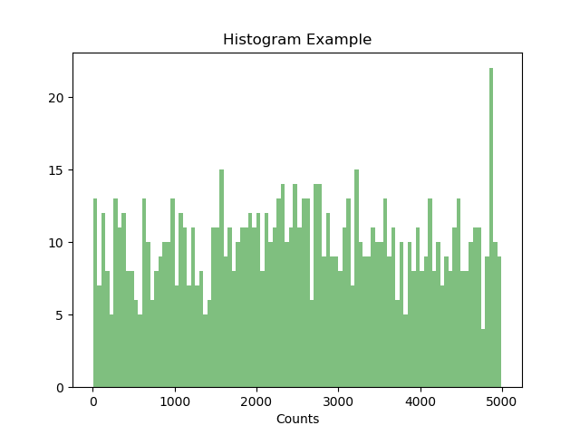
A histogram divides numerical observations into intervals called bins and displays how many observations fall into each interval. It is useful for inspecting the shape, spread, concentration, and possible outliers of a numerical dataset.
In the following example, pyplot.hist() groups randomly sampled values into 100 bins. The function returns the bin counts, bin boundaries, and the graphical patch objects used to draw the bars.
example.py
from matplotlib import pyplot as plt
from matplotlib import style
import random

x = random.sample(range(1, 5000), 1000)
num_bins = 100
n, bins, patches = plt.hist(x, num_bins, facecolor='green', alpha=0.5)

plt.title('Histogram Example')
plt.xlabel('Values')
plt.xlabel('Counts')
plt.show()
The num_bins value affects the amount of detail shown in the distribution. Too few bins can hide useful variation, while too many bins can make random fluctuations appear more significant than they are. In this existing example, the final axis-label call uses xlabel() a second time; in a new program, use ylabel('Counts') when labeling the vertical count axis.
Create a Matplotlib Pie Chart with Labels and Percentages
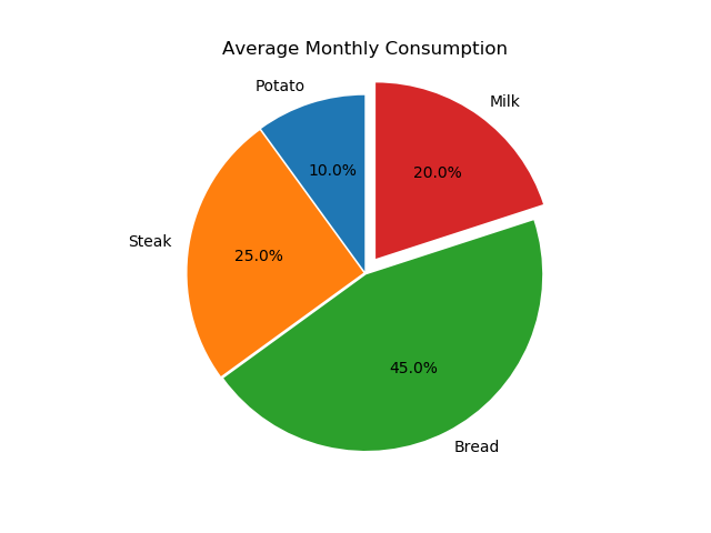
A pie chart represents category values as sectors of a circle. Each sector’s angle and area are proportional to its value relative to the total. Pie charts are most readable when the categories are few, mutually exclusive, and form a meaningful whole.
This example uses pyplot.pie(). The labels argument names the sectors, sizes supplies their values, autopct displays percentages, and explode offsets selected sectors from the center.
example.py
import matplotlib.pyplot as plt

# Pie chart, where the slices will be ordered and plotted counter-clockwise:
labels = 'Potato', 'Steak', 'Bread', 'Milk'
sizes = [10, 25, 45, 20]
explode = (0.01, 0.01, 0.01, 0.1)  # explode 'Milk' a little away

fig1, ax1 = plt.subplots()
ax1.pie(sizes, explode=explode, labels=labels, autopct='%1.1f%%',
        shadow=False, startangle=90)
ax1.axis('equal')  # Equal aspect ratio ensures that pie is drawn as a circle.

plt.title('Average Monthly Consumption')

plt.show()
The values total 100 in this example, but Matplotlib can also normalize other positive values into proportions. Calling ax1.axis('equal') applies an equal aspect ratio so the pie is displayed as a circle rather than an ellipse.
Create Multiple Matplotlib Subplots in One Figure
Subplots place multiple axes inside one figure. They are useful when related charts should be compared without overlaying every dataset on the same axes.
import matplotlib.pyplot as plt

months = ['Jan', 'Feb', 'Mar', 'Apr']
revenue = [18, 23, 21, 29]
orders = [120, 155, 148, 190]

fig, axes = plt.subplots(1, 2, figsize=(10, 4))

axes[0].plot(months, revenue, marker='o')
axes[0].set_title('Monthly Revenue')
axes[0].set_ylabel('Revenue')

axes[1].bar(months, orders)
axes[1].set_title('Monthly Orders')
axes[1].set_ylabel('Orders')

fig.suptitle('Business Summary')
fig.tight_layout()
plt.show()
The arguments 1, 2 create one row containing two axes. The returned axes collection lets each subplot be configured independently. Other layouts, such as two rows and two columns, can be created with plt.subplots(2, 2).
Save a Matplotlib Figure as PNG, SVG, or PDF
Use savefig() to write a figure to a file. Matplotlib infers the output format from the filename extension.
import matplotlib.pyplot as plt

x = [1, 2, 3, 4]
y = [10, 18, 15, 24]

fig, ax = plt.subplots()
ax.plot(x, y, marker='o')
ax.set_title('Sample Trend')
ax.set_xlabel('Period')
ax.set_ylabel('Value')

fig.tight_layout()
fig.savefig('sample-trend.png', dpi=300, bbox_inches='tight')
fig.savefig('sample-trend.svg', bbox_inches='tight')
fig.savefig('sample-trend.pdf', bbox_inches='tight')

plt.show()
The dpi argument controls raster resolution for formats such as PNG. Vector formats such as SVG and PDF preserve lines and text as scalable graphical elements. Saving before show() is a reliable ordering when working across different environments and backends.
Common Matplotlib Problems and Corrections
- No module named matplotlib: install the package in the active Python environment and verify the selected interpreter.
- x and y must have same first dimension: supply the same number of x-values and y-values.
- The legend is empty: provide a
labelfor each plotted dataset before callinglegend(). - Axis labels are clipped: call
fig.tight_layout()or save withbbox_inches='tight'. - A script runs but no chart appears: call
plt.show()in a standard Python script and check that the environment supports a suitable Matplotlib backend. - Repeated plots overlap unexpectedly: create a new figure with
plt.subplots()or close a finished figure withplt.close(fig).
Matplotlib Tutorial FAQs
What is Matplotlib used for in Python?
Matplotlib is used to turn Python data into visualizations such as line charts, scatter plots, bar graphs, histograms, pie charts, heatmaps, and multi-panel figures. It also provides controls for axes, ticks, annotations, legends, styles, and exported image files.
What is the difference between Matplotlib and pyplot?
Matplotlib is the complete visualization library. matplotlib.pyplot is a module within that library that provides plotting functions and manages the current figure and axes. It is commonly imported as plt.
Should beginners use pyplot or the Matplotlib object-oriented interface?
The pyplot interface is convenient for short examples. The object-oriented interface, using objects returned by plt.subplots(), is easier to organize when a figure has several plots or requires extensive customization. Learning both approaches is useful because existing Python examples commonly use both.
Can Matplotlib be used in Jupyter Notebook?
Yes. Matplotlib figures can be displayed directly in Jupyter Notebook cells. In modern notebook environments, importing matplotlib.pyplot and calling plt.show() is usually sufficient. The selected notebook backend determines whether the result is static or interactive.
When should Seaborn be used instead of Matplotlib?
Seaborn provides a higher-level interface for statistical graphics and works closely with pandas data structures. Matplotlib remains the underlying plotting foundation and provides detailed control over figures and axes. They can be used together when a Seaborn chart needs additional Matplotlib customization.
Matplotlib Tutorial Editorial QA Checklist
- Confirm that every Matplotlib example imports the module or alias it uses.
- Check that paired x and y sequences have equal lengths.
- Verify that chart titles, axis labels, units, and legends describe the displayed data accurately.
- Run each added Python example in a clean environment with Matplotlib installed.
- Check that saved-figure examples create the stated PNG, SVG, or PDF file.
- Confirm that histogram descriptions distinguish numerical bins from categorical bars.
- Review pie-chart examples to ensure the categories form a meaningful whole.
- Verify that every new WordPress code block uses the appropriate PrismJS language class.