Matplotlib – Plot a Grouped Bar Chart
To plot a Grouped Bar Chart using Matplotlib, create a subplot using subplots() function, and in this subplot call bar() function with different X-axis position to draw each of the bar graph from different individual bar graphs, so that they form groups.
The syntax to plot a Grouped Bar Chart with two bars in each group is
width = 0.3
fig, ax = plt.subplots()
bar1 = ax.bar(x - width/2, heights_1, width)
bar2 = ax.bar(x + width/2, heights_2, width)
where x is ticks on X-axis, and hights_N is a the bar heights of an Nth Bar chart.
The syntax to plot a Grouped Bar Chart with three bars in each group is
width = 0.3
fig, ax = plt.subplots()
bar1 = ax.bar(x - width, heights_1, width)
bar2 = ax.bar(x, heights_2, width)
bar3 = ax.bar(x + width, heights_3, width)
Examples
Plot Grouped Bar Chart with Two Bars in Each Group
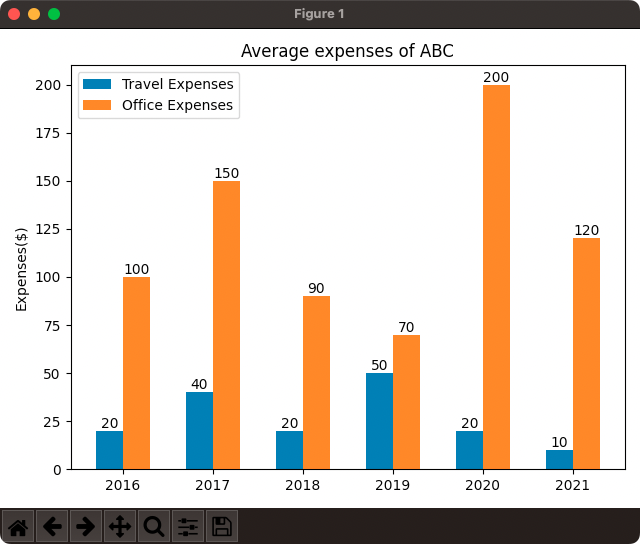
In the following program, we will take office, and travel expenditure data (two bars, one for each data) for different years and draw them using grouped bar chart.
example.py
import matplotlib.pyplot as plt
import numpy as np

#data
#x-axis
years = [2016, 2017, 2018, 2019, 2020, 2021]
#y-axis
office_expenses = [100, 150, 90, 70, 200, 120]
travel_expenses = [20, 40, 20, 50, 20, 10]

#bar chart properties
x = np.arange(len(years))
width = 0.3

#draw grouped bar chart
fig, ax = plt.subplots()
bar1 = ax.bar(x - width/2, travel_expenses, width, label='Travel Expenses')
bar2 = ax.bar(x + width/2, office_expenses, width, label='Office Expenses')

#ax.set_xlabel('Year')
ax.set_ylabel('Expenses($)')
ax.set_title('Average expenses of ABC')
ax.set_xticks(x, years)
ax.legend()

#setting bar labels
ax.bar_label(bar1)
ax.bar_label(bar2)

fig.tight_layout()

plt.show()
Output

Plot Grouped Bar Chart with Three Bars in Each Group
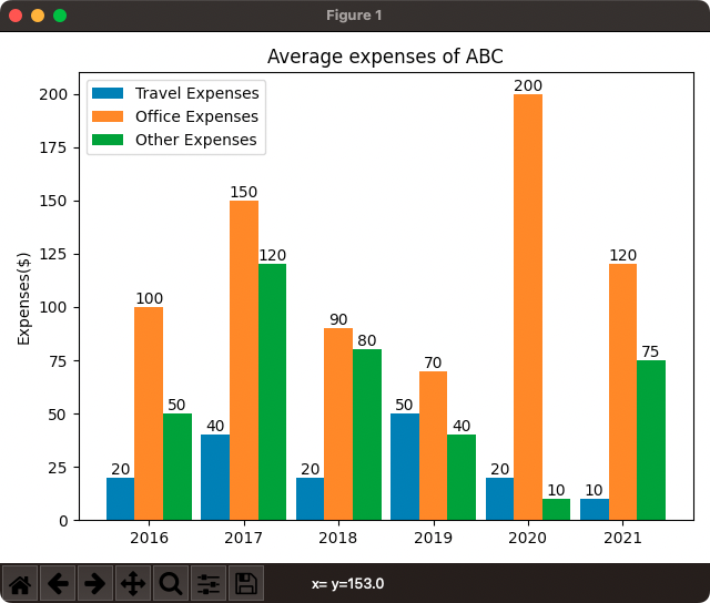
In the following program, we will take office, travel, and other expenditure data for different years and draw them using grouped bar chart, with three bars in each group.
example.py
import matplotlib.pyplot as plt
import numpy as np

#data
#x-axis
years = [2016, 2017, 2018, 2019, 2020, 2021]
#y-axis
office_expenses = [100, 150, 90, 70, 200, 120]
travel_expenses = [20, 40, 20, 50, 20, 10]
other_expenses = [50, 120, 80, 40, 10, 75]

#bar chart properties
x = np.arange(len(years))
width = 0.3

#draw grouped bar chart
fig, ax = plt.subplots()
bar1 = ax.bar(x - width, travel_expenses, width, label='Travel Expenses')
bar2 = ax.bar(x, office_expenses, width, label='Office Expenses')
bar3 = ax.bar(x + width, other_expenses, width, label='Other Expenses')

#ax.set_xlabel('Year')
ax.set_ylabel('Expenses($)')
ax.set_title('Average expenses of ABC')
ax.set_xticks(x, years)
ax.legend()

#setting bar labels
ax.bar_label(bar1)
ax.bar_label(bar2)
ax.bar_label(bar3)

fig.tight_layout()

plt.show()
Output

Conclusion
In this Matplotlib Tutorial, we learned how to plot a Stacked Bar Chart using Matplotlib PyPlot API.
