Matplotlib – Plot a Horizontal Bar Chart
To plot a Horizontal Bar Chart using Matplotlib, create a subplot using subplots() function. In this subplot call barh() function and pass the Y-axis positions, and bar widths as arguments.
The syntax to plot a Horizontal Bar Chart is
Axes.barh(y, width, height=0.8, left=None, *, align='center', **kwargs)where
Axesis the object returned by subplots().yis the Y-axis coordinates of the bars.widthis the width(s) of the bars.
Examples
A Simple Horizontal Bar Chart
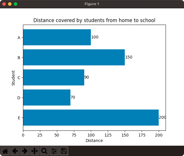
In the following program, we will take a list of students and the distance they cover daily from home to school, and plot it on a Horizontal Bar Chart, with student name on the Y-axis and the distance on X-axis.
example.py
import matplotlib.pyplot as plt
import numpy as np

#plot data
students = ['A', 'B', 'C', 'D', 'E']
y = np.arange(len(students))
width = [100, 150, 90, 70, 200]

#draw grouped bar chart
fig, ax = plt.subplots()
hbars = ax.barh(y, width)

ax.set_yticks(y, labels=students)
ax.set_ylabel('Student')
ax.set_xlabel('Distance')
ax.set_title('Distance covered by students from home to school')
ax.invert_yaxis()  # labels read top-to-bottom

ax.bar_label(hbars)

plt.show()
Output

Horizontal Bar Chart with Specific Height and Color
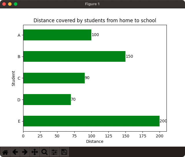
In the following program, we will draw the Horizontal Bar Chart with the data used in the above example, but change the bar height to 0.5 and the bar color to 'green'.
example.py
import matplotlib.pyplot as plt
import numpy as np

#plot data
students = ['A', 'B', 'C', 'D', 'E']
y = np.arange(len(students))
width = [100, 150, 90, 70, 200]

#draw grouped bar chart
fig, ax = plt.subplots()
hbars = ax.barh(y, width, height=0.5, color='green')

ax.set_yticks(y, labels=students)
ax.set_ylabel('Student')
ax.set_xlabel('Distance')
ax.set_title('Distance covered by students from home to school')
ax.invert_yaxis()  # labels read top-to-bottom

ax.bar_label(hbars)

plt.show()
Output

Conclusion
In this Matplotlib Tutorial, we learned how to plot a Horizontal Bar Chart using Matplotlib PyPlot API.
