SwiftUI – TextField Placeholder Color
In SwiftUI, a TextField is commonly used to accept user input, and the placeholder serves as a hint for what should be entered. By default, the placeholder text color is determined by the system and may not match your design preferences. While SwiftUI does not directly provide a modifier to change the placeholder color, you can achieve this using a combination of a ZStack and conditional views.

In this SwiftUI tutorial, we will explore how to customise the placeholder color for a TextField in SwiftUI using practical examples.
Customising Placeholder Color
To change the placeholder color, wrap the TextField inside a ZStack. Add a Text view for the placeholder, and conditionally show or hide it based on whether the bound text variable is empty.
Basic Syntax
The general approach to customize placeholder color is:
ZStack(alignment: .leading) {
    if boundVariable.isEmpty {
        Text("Placeholder Text")
            .foregroundColor(Color.placeholderColor)
            .padding(.leading, paddingAmount)
    }
    TextField("", text: $boundVariable)
}
Here:
boundVariable: The state variable bound to theTextField.Text("Placeholder Text"): The custom-styled placeholder text..foregroundColor(Color.placeholderColor): Sets the desired color for the placeholder text.ZStack: Ensures the placeholder andTextFieldoverlap in the same position.
Examples
Let’s look at examples of how to customize placeholder color for TextField in SwiftUI.
Example 1: Custom Placeholder Color
This example demonstrates how to set a custom placeholder color using a ZStack:
Code Example:
import SwiftUI

struct ContentView: View {
    @State private var email: String = ""

    var body: some View {
        ZStack(alignment: .leading) {
            if email.isEmpty {
                Text("Enter your email")
                    .foregroundColor(.gray) // Custom placeholder color
                    .padding(.leading, 8)
            }
            TextField("", text: $email)
                .padding(8)
                .overlay(
                    RoundedRectangle(cornerRadius: 8)
                        .stroke(Color.gray, lineWidth: 1)
                )
        }
        .padding()
    }
}
Explanation:
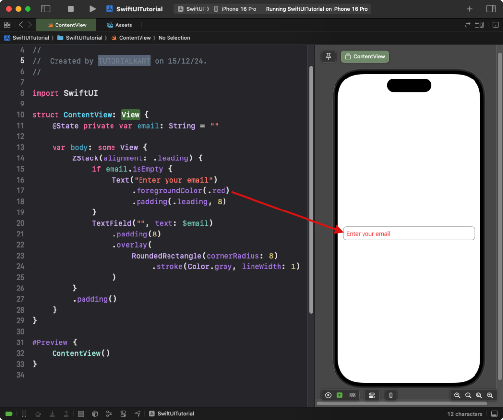
- The
ZStackoverlays the placeholder text and theTextField. - The placeholder text appears only when the
emailvariable is empty. - The placeholder color is set to
.redusing.foregroundColor().
Result: A text field with custom-styled placeholder text “Enter your email” in gray appears.
Example 2: Reusable Placeholder Style
You can create a reusable style for text fields with custom placeholder colors:
Code Example:
import SwiftUI

struct PlaceholderTextField: View {
    var placeholder: String
    @Binding var text: String
    var placeholderColor: Color = .green

    var body: some View {
        ZStack(alignment: .leading) {
            if text.isEmpty {
                Text(placeholder)
                    .foregroundColor(placeholderColor)
                    .padding(.leading, 8)
            }
            TextField("", text: $text)
                .padding(8)
                .overlay(
                    RoundedRectangle(cornerRadius: 8)
                        .stroke(Color.gray, lineWidth: 1)
                )
        }
    }
}

struct ContentView: View {
    @State private var username: String = ""

    var body: some View {
        PlaceholderTextField(placeholder: "Enter your username", text: $username)
            .padding()
    }
}
Explanation:
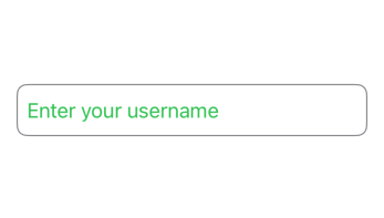
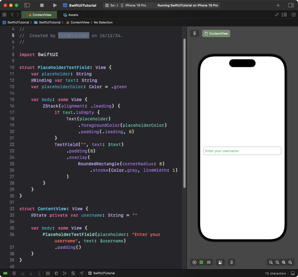
PlaceholderTextFieldis a reusable component for text fields with customizable placeholders.- The placeholder color is set using the
placeholderColorparameter. - Each instance of
PlaceholderTextFieldcan define its own placeholder and binding variable.
Result: A reusable text field with a custom-styled placeholder appears.
Conclusion
While SwiftUI does not natively support direct customization of placeholder color, using a ZStack with conditional views provides an elegant solution. With reusable components, you can apply consistent placeholder styling across your app to match your design preferences.
