Why the Flutter RaisedButton Color Property Is Not Working
A Flutter RaisedButton can appear grey even when its color property is set. This usually happens because the button does not have an enabled onPressed callback.
When onPressed is omitted or set to null, Flutter treats the button as disabled. A disabled button uses its disabled-state styling instead of the normal color supplied through the color property.
Enable RaisedButton to Apply Its Color
Add a non-null function to the onPressed property:
RaisedButton(
onPressed: () {},
color: Colors.lightGreen,
child: Text('Click Me'),
)
The callback may be empty while testing the layout, but production code should perform the action expected from the button. The important point is that onPressed must contain a function rather than null.
RaisedButton Without onPressed Uses the Disabled Color
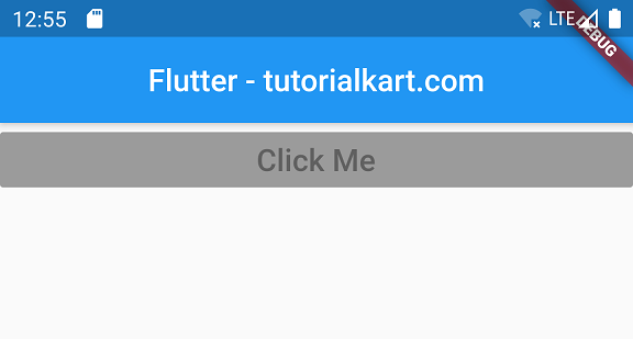
In the following example, the RaisedButton has a light-green color, but no onPressed callback is provided.
main.dart
import 'package:flutter/material.dart';
void main() {
runApp(MyApp());
}
class MyApp extends StatefulWidget {
@override
_MyAppState createState() => _MyAppState();
}
class _MyAppState extends State<MyApp> {
@override
Widget build(BuildContext context) {
return MaterialApp(
home: Scaffold(
appBar: AppBar(
title: Center(child: Text('Flutter - tutorialkart.com')),
),
body: Container(
child: ListView(children: <Widget>[
Container(
child: RaisedButton(
textColor: Colors.white,
color: Colors.lightGreen,
child: Text(
'Click Me',
style: TextStyle(fontSize: 20),
))),
])),
));
}
}
Because the callback is missing, Flutter places the button in its disabled state. The normal light-green color is therefore not displayed.

RaisedButton Color Works After Adding onPressed
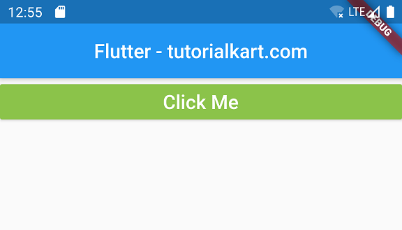
The next example adds a function to onPressed. This changes the button to its enabled state, allowing the supplied color value to appear.
main.dart
import 'package:flutter/material.dart';
void main() {
runApp(MyApp());
}
class MyApp extends StatefulWidget {
@override
_MyAppState createState() => _MyAppState();
}
class _MyAppState extends State<MyApp> {
@override
Widget build(BuildContext context) {
return MaterialApp(
home: Scaffold(
appBar: AppBar(
title: Center(child: Text('Flutter - tutorialkart.com')),
),
body: Container(
child: ListView(children: <Widget>[
Container(
child: RaisedButton(
onPressed: () => {},
textColor: Colors.white,
color: Colors.lightGreen,
child: Text(
'Click Me',
style: TextStyle(fontSize: 20),
))),
])),
));
}
}
When this application runs, the button displays the specified light-green background because its onPressed callback is non-null.

Use ElevatedButton in Current Flutter Code
RaisedButton belongs to Flutter’s older button API. For new applications, use ElevatedButton and set its background color through style.
ElevatedButton(
onPressed: () {
// Handle the button press.
},
style: ElevatedButton.styleFrom(
backgroundColor: Colors.lightGreen,
foregroundColor: Colors.white,
),
child: const Text('Click Me'),
)
For ElevatedButton, backgroundColor controls the button background and foregroundColor controls its text and icon color. As with RaisedButton, setting onPressed to null disables the button.
Set a Separate Color for the Disabled Button State
Sometimes a button is intentionally disabled. In that case, define both its enabled and disabled colors instead of adding a callback only to force the enabled appearance.
final bool canSubmit = false;
ElevatedButton(
onPressed: canSubmit ? () {
// Submit the form.
} : null,
style: ElevatedButton.styleFrom(
backgroundColor: Colors.lightGreen,
disabledBackgroundColor: Colors.grey.shade400,
foregroundColor: Colors.white,
disabledForegroundColor: Colors.white70,
),
child: const Text('Submit'),
)
This approach preserves the button’s disabled behavior while making its disabled appearance explicit.
Check These Causes When a Flutter Button Color Still Does Not Change
- Confirm that
onPressedis notnullwhen the button should be enabled. - For
ElevatedButton, usebackgroundColorinside its style rather than the oldcolorproperty. - Check whether a local
ButtonStyleor application theme is supplying another state-specific color. - Perform a hot restart if a theme or widget-style change is not reflected after a hot reload.
- Use a disabled color deliberately when application logic prevents the user from pressing the button.
RaisedButton Color Questions
Why does RaisedButton remain grey after setting color?
The button is usually disabled because onPressed is missing or null. A disabled button uses its disabled-state color instead of its normal color.
Can I enable RaisedButton with an empty callback?
Yes. An empty callback such as onPressed: () {} makes the button enabled. However, the callback should normally perform a meaningful action or the button should remain disabled.
What replaces the RaisedButton color property?
With ElevatedButton, set the enabled background using backgroundColor in a ButtonStyle or through ElevatedButton.styleFrom().
How do I color a disabled ElevatedButton?
Set disabledBackgroundColor and, when necessary, disabledForegroundColor in the button style. The button remains disabled while using the colors you specify.
Flutter Button Color Fix Summary
A RaisedButton ignores its normal color when it is disabled. Provide a non-null onPressed callback when the button should be interactive. In current Flutter code, use ElevatedButton with backgroundColor, and configure a separate disabled color when disabling the button is intentional.
In this Flutter Tutorial, we learned how to enable RaisedButton widget and make color working for it.
TutorialKart.com