RangeSlider Widget – Active Color, Inactive Color
We can change the active area of slider, and inactive area of slider using activeColor, and inactiveColor properties of RangeSlider class respectively.
Syntax
The syntax of RangeSlider widget with different color properties is
</>
Copy
RangeSlider(
  ...
  activeColor: Color.black,
  inactiveColor: Color.black12,
),
Example
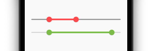
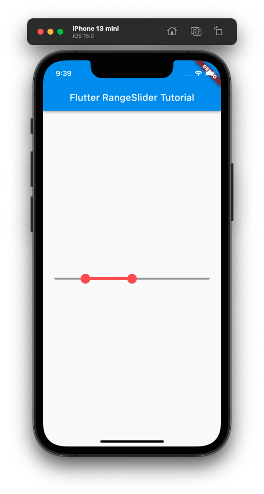
In the following example, we create a Flutter Application, with active slider color set to redAccent, and inactive slider color set to grey.
main.dart
</>
Copy
import 'package:flutter/material.dart';

void main() => runApp(const MyApp());

class MyApp extends StatelessWidget {
  const MyApp({Key? key}) : super(key: key);

  static const String _title = 'Flutter RangeSlider Tutorial';

  @override
  Widget build(BuildContext context) {
    return MaterialApp(
      title: _title,
      home: Scaffold(
        appBar: AppBar(title: const Text(_title)),
        body: const MyStatefulWidget(),
      ),
    );
  }
}

class MyStatefulWidget extends StatefulWidget {
  const MyStatefulWidget({Key? key}) : super(key: key);

  @override
  State<MyStatefulWidget> createState() => _MyStatefulWidgetState();
}

class _MyStatefulWidgetState extends State<MyStatefulWidget> {
  var selectedRange = const RangeValues(0.2, 0.5);

  @override
  Widget build(BuildContext context) {
    return Column(
        mainAxisAlignment: MainAxisAlignment.center,
        children: [
          RangeSlider(
            values: selectedRange,
            onChanged: (RangeValues newRange) {
              setState(() {
                selectedRange = newRange;
              });
            },
            activeColor: Colors.redAccent,
            inactiveColor: Colors.grey,
          ),
        ]
    );
  }
}
Screenshot
Conclusion
In this Flutter Tutorial, we learned how to change the colors of active area, and inactive area of RangeSlider widget, with examples.