Flutter TextButton
Flutter TextButton class is used to display a material design Text Button that has no borders by default. TextButton is generally used on toolbars, dialogs, inline with text or other content, etc.
By default, when a TextButton button is pressed, ripple effect is shown.
Syntax
The syntax to display a TextButton widget with onPressed callback and text inside the button, is shown in the following.
TextButton(
  onPressed: () { },
  child: const Text('Click Me'),
)
Example
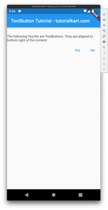
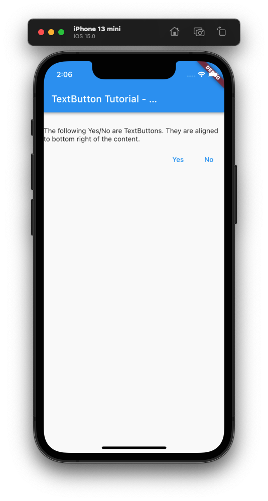
In the following Flutter Application, we shall display two Text Buttons with the text 'Yes', 'No' respectively. We shall align these buttons below the content, and to the right of the screen.
main.dart
import 'package:flutter/material.dart';

void main() => runApp(const MyApp());

/// main application widget
class MyApp extends StatelessWidget {
  const MyApp({Key? key}) : super(key: key);

  static const String _title = 'TextButton Tutorial - tutorialkart.com';

  @override
  Widget build(BuildContext context) {
    return MaterialApp(
      title: _title,
      home: Scaffold(
        appBar: AppBar(title: const Text(_title)),
        body: const MyStatelessWidget(),
      ),
    );
  }
}

/// stateless widget that the main application instantiates
class MyStatelessWidget extends StatelessWidget {
  const MyStatelessWidget({Key? key}) : super(key: key);

  @override
  Widget build(BuildContext context) {
    return  Column(
      crossAxisAlignment: CrossAxisAlignment.start,
      children: <Widget>[
        const SizedBox(height: 30),
        Text('The following Yes/No are TextButtons. They are aligned to bottom right of the content.'),
        const SizedBox(height: 10),
        Row(
          mainAxisAlignment: MainAxisAlignment.end,
          children: [
            TextButton(
              onPressed: () {},
              child: const Text('Yes'),
            ),
            TextButton(
              onPressed: () {},
              child: const Text('No'),
            ),
          ],
        )
      ],
    );
  }
}
Screenshot – Android Emulator

Screenshot – iPhone Simulator

Conclusion
In this Flutter Tutorial, we learned how to display TextButton in our Flutter Application, with examples.
