 TutorialKart.com
Flutter ToggleButtons Widget
The Flutter ToggleButtons widget displays a horizontal group of buttons whose selected states are controlled by a list of Boolean values. It is useful when users need to select one or more related options represented by icons, text, or other widgets.
Each child in children must have a corresponding value in isSelected. When a button is pressed, Flutter passes its index to onPressed, where you update the appropriate Boolean value inside setState().
ToggleButtons Selection State and Button Index
Following is a simple and quick code snippet on how to use ToggleButtons widget. Following code should go to your State class.
List<bool> _selections = List.generate(3, (_)=> false);

@override
Widget build(BuildContext context) {
  ...
  ToggleButtons(
    children: <Widget>[
      Icon(Icons.add_comment),
      Icon(Icons.airline_seat_individual_suite),
      Icon(Icons.add_location),
    ],
    isSelected: _selections,
    onPressed: (int index) {
      setState(() {
        _selections[index] = !_selections[index];
      });
    },
  )
  ...
}
The list contains three values because the widget contains three children. All values begin as false, so none of the buttons is initially selected. Pressing a button changes only the value stored at that button’s index.
childrendefines the visible buttons.isSelecteddefines which buttons are selected.onPressedreceives the zero-based index of the pressed button.setState()rebuilds the widget with the updated selection list.
Flutter ToggleButtons Example with Multiple Selection
In the following program, we use ToggleButtons widget with three icon widgets as children.
main.dart
import 'package:flutter/material.dart';

void main() {
  runApp(MyApp());
}

class MyApp extends StatefulWidget {
  @override
  _MyAppState createState() => _MyAppState();
}

class _MyAppState extends State<MyApp> {
  List<bool> _selections = List.generate(3, (_) => false);
  @override
  Widget build(BuildContext context) {
    return MaterialApp(
        home: Scaffold(
      appBar: AppBar(
        title: Center(child: Text('Flutter - tutorialkart.com')),
      ),
      body: ListView(children: <Widget>[
        Container(
            alignment: Alignment.center,
            margin: EdgeInsets.all(10),
            padding: EdgeInsets.all(20),
            child: ToggleButtons(
              children: <Widget>[
                Icon(Icons.add_comment),
                Icon(Icons.airline_seat_individual_suite),
                Icon(Icons.add_location),
              ],
              isSelected: _selections,
              onPressed: (int index) {
                setState(() {
                  _selections[index] = !_selections[index];
                });
              },
            ))
      ]),
    ));
  }
}
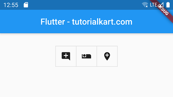
When you run this application, you will get UI as shown below.
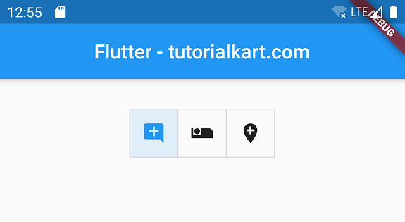
When you click a toggle button, its foreground and background styling changes to indicate that it is selected.
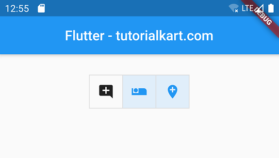
Pressing the same button again changes its value back to false and returns it to the unselected state. Because every button has a separate Boolean value, multiple buttons can remain selected at the same time.
Modern Flutter ToggleButtons Example with Text and Icons
The following null-safe example adds labels, tooltips, selected colors, borders, and minimum button dimensions. It retains the multiple-selection behavior of the original example.
import 'package:flutter/material.dart';

void main() {
  runApp(const ToggleButtonsApp());
}

class ToggleButtonsApp extends StatelessWidget {
  const ToggleButtonsApp({super.key});

  @override
  Widget build(BuildContext context) {
    return MaterialApp(
      home: Scaffold(
        appBar: AppBar(
          title: const Text('Flutter ToggleButtons'),
        ),
        body: const Center(
          child: ViewToggleButtons(),
        ),
      ),
    );
  }
}

class ViewToggleButtons extends StatefulWidget {
  const ViewToggleButtons({super.key});

  @override
  State<ViewToggleButtons> createState() => _ViewToggleButtonsState();
}

class _ViewToggleButtonsState extends State<ViewToggleButtons> {
  final List<bool> _isSelected = <bool>[true, false, false];

  @override
  Widget build(BuildContext context) {
    return ToggleButtons(
      isSelected: _isSelected,
      onPressed: (int index) {
        setState(() {
          _isSelected[index] = !_isSelected[index];
        });
      },
      selectedColor: Colors.white,
      color: Colors.black87,
      fillColor: Colors.blue,
      borderRadius: BorderRadius.circular(8),
      constraints: const BoxConstraints(
        minWidth: 90,
        minHeight: 48,
      ),
      children: const <Widget>[
        Tooltip(
          message: 'List view',
          child: Row(
            mainAxisAlignment: MainAxisAlignment.center,
            children: <Widget>[
              Icon(Icons.view_list),
              SizedBox(width: 6),
              Text('List'),
            ],
          ),
        ),
        Tooltip(
          message: 'Grid view',
          child: Row(
            mainAxisAlignment: MainAxisAlignment.center,
            children: <Widget>[
              Icon(Icons.grid_view),
              SizedBox(width: 6),
              Text('Grid'),
            ],
          ),
        ),
        Tooltip(
          message: 'Map view',
          child: Row(
            mainAxisAlignment: MainAxisAlignment.center,
            children: <Widget>[
              Icon(Icons.map),
              SizedBox(width: 6),
              Text('Map'),
            ],
          ),
        ),
      ],
    );
  }
}
Allow Only One ToggleButton to Be Selected
For mutually exclusive options, update every value when a button is pressed. Set the pressed index to true and all other indexes to false. This produces radio-button-like behavior while retaining the appearance of ToggleButtons.
onPressed: (int selectedIndex) {
  setState(() {
    for (int index = 0; index < _isSelected.length; index++) {
      _isSelected[index] = index == selectedIndex;
    }
  });
},
This pattern always keeps exactly one button selected. Initialize one list value as true if the interface must start with a selected option.
Require at Least One Selected ToggleButton
Some interfaces allow multiple selections but should not allow users to deselect the final active option. Count the selected values before changing a selected button to false.
onPressed: (int index) {
  final int selectedCount =
      _isSelected.where((bool selected) => selected).length;

  if (_isSelected[index] && selectedCount == 1) {
    return;
  }

  setState(() {
    _isSelected[index] = !_isSelected[index];
  });
},
Customize ToggleButtons Colors, Borders, and Size
ToggleButtons provides separate properties for selected and unselected states. These properties let you make the current selection visible without changing the child widgets manually.
| ToggleButtons property | Purpose |
|---|---|
color | Foreground color of unselected children |
selectedColor | Foreground color of selected children |
fillColor | Background color of selected buttons |
disabledColor | Foreground color used when onPressed is null |
borderColor | Border color of unselected buttons |
selectedBorderColor | Border color of selected buttons |
borderRadius | Corner radius of the complete button group |
constraints | Minimum width and height of each button |
renderBorder | Controls whether button borders are drawn |
Disable a Flutter ToggleButtons Group
Set onPressed to null to disable the complete group. The values in isSelected can still indicate the current state, but users cannot change them until a callback is supplied again.
ToggleButtons(
  isSelected: _isSelected,
  onPressed: null,
  children: const <Widget>[
    Icon(Icons.format_bold),
    Icon(Icons.format_italic),
    Icon(Icons.format_underlined),
  ],
)
ToggleButtons and SegmentedButton in Current Flutter Apps
ToggleButtons remains useful for existing interfaces and for button groups requiring direct Boolean-list control. For new Material 3 interfaces, Flutter also provides SegmentedButton, which represents selections with a Set and supports single-selection and multi-selection configurations.
The following example uses SegmentedButton for a single view-mode selection.
enum ViewMode { list, grid, map }

class ViewModeSelector extends StatefulWidget {
  const ViewModeSelector({super.key});

  @override
  State<ViewModeSelector> createState() => _ViewModeSelectorState();
}

class _ViewModeSelectorState extends State<ViewModeSelector> {
  ViewMode _selectedMode = ViewMode.list;

  @override
  Widget build(BuildContext context) {
    return SegmentedButton<ViewMode>(
      segments: const <ButtonSegment<ViewMode>>[
        ButtonSegment<ViewMode>(
          value: ViewMode.list,
          icon: Icon(Icons.view_list),
          label: Text('List'),
        ),
        ButtonSegment<ViewMode>(
          value: ViewMode.grid,
          icon: Icon(Icons.grid_view),
          label: Text('Grid'),
        ),
        ButtonSegment<ViewMode>(
          value: ViewMode.map,
          icon: Icon(Icons.map),
          label: Text('Map'),
        ),
      ],
      selected: <ViewMode>{_selectedMode},
      onSelectionChanged: (Set<ViewMode> selection) {
        setState(() {
          _selectedMode = selection.first;
        });
      },
    );
  }
}
Common Flutter ToggleButtons Errors
- The number of children and selection values differs: keep
children.lengthequal toisSelected.length. - A press does not update the interface: change the Boolean list inside
setState()when the list belongs to the widget’s State. - Every button changes together: update only the value at the pressed index unless the interface intentionally uses single-selection logic.
- The group overflows on a narrow screen: reduce the child widths, use shorter labels, or place the group in a horizontally scrollable widget.
- Icons are unclear: add visible text labels, semantic labels, or
Tooltipwidgets so users can identify each action.
Flutter ToggleButtons FAQs
Can multiple ToggleButtons be selected at the same time?
Yes. Store a separate Boolean value for each button and toggle only the value at the pressed index. Any number of values may be true at the same time.
How do I make Flutter ToggleButtons single-select?
When a button is pressed, iterate through the selection list and set only the pressed index to true. Set every other index to false.
Why must isSelected match the number of ToggleButtons children?
Flutter reads one selection value for each child using the same index. A length mismatch means the widget cannot determine the selected state of every button.
How do I disable ToggleButtons in Flutter?
Pass null to onPressed. Flutter then displays the group in its disabled state and ignores user presses.
Should I use ToggleButtons or SegmentedButton?
Use ToggleButtons when maintaining an existing implementation or when Boolean-list state fits the interface. Consider SegmentedButton for a new Material 3 interface with clearly defined selectable values.
Flutter ToggleButtons Editorial Review Checklist
- Confirm that
childrenandisSelectedcontain the same number of items. - Verify whether the interface requires multiple selection, exactly one selection, or at least one selection.
- Check selected and unselected colors for sufficient text and icon contrast.
- Test the button group at narrow screen widths and with larger text settings.
- Ensure icon-only buttons have tooltips or other accessible labels.
- Confirm that disabled ToggleButtons remain visually distinguishable from enabled buttons.
Summary of Flutter ToggleButtons Selection
A Flutter ToggleButtons group uses children for its visible controls and isSelected for their states. Update the Boolean value associated with the pressed index to support multiple selection, or update the entire list to enforce single selection. Styling properties control the selected colors, borders, dimensions, and disabled appearance.
In this Flutter Tutorial, we learned how to create, style, disable, and manage single or multiple selections with ToggleButtons.