Android Snackbar
Android Snackbar is a material design component introduced with API 22.2.0. The functionality would resemble Android Toast, but unlike Toast, Snackbar could be dismissed by user or an action listener could be setup to respond to user actions.
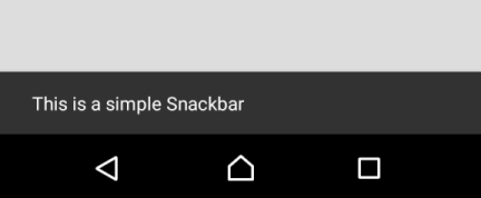
Snackbar when shown, is displayed at the bottom of the screen, with default background color “#323232” and text color “#FFFFFF“. You may change the background and text color. We shall go through that in the tutorial – Snackbar – Change Background and Text Color.
The following screenshot is an example, of Snackbar sliding from from bottom of the screen, displaying a message.

Important Note : To use Snackbar in your android application, you need to include the ‘com.android.support.design’ package in your build.gradle (app) dependencies. There are different available versions of the package. You need to include the one with version matching the compileSdkVersion.
For example :
android {
    compileSdkVersion 26
    ...
}

dependencies {
    ...
    implementation 'com.android.support:design:26.1.0'
    ...
}
Once you modify the build.gradle (Module:app), Android Studio asks for Gradle Sync. Sync gradle and you are good to use Snackbar in your project.
Example – Kotlin Android Snackbar
Create an Android Application with Kotlin Support and find the code for activity_main.xml layout file and MainActivity.kt provided below.
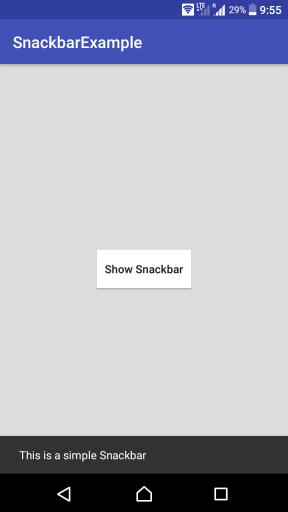
In this Kotlin Android Snackbar Example, we shall display a button, and when the button is clicked, Snackbar is displayed at the bottom of the screen.
activity_main.xml
<?xml version="1.0" encoding="utf-8"?>
<LinearLayout xmlns:android="http://schemas.android.com/apk/res/android"
    xmlns:tools="http://schemas.android.com/tools"
    android:orientation="vertical"
    android:gravity="center"
    android:background="#DDDDDD"
    android:layout_width="match_parent"
    android:layout_height="match_parent"
    tools:context=".MainActivity">

    <Button
        android:id="@+id/btn"
        android:background="#FFFFFF"
        android:textAllCaps="false"
        android:padding="10sp"
        android:layout_width="wrap_content"
        android:layout_height="wrap_content"
        android:text="Show Snackbar"
         />

</LinearLayout>
MainActivity.kt
package com.tutorialkart.snackbarexample

import android.support.v7.app.AppCompatActivity
import android.os.Bundle
import android.support.design.widget.Snackbar
import kotlinx.android.synthetic.main.activity_main.*

class MainActivity : AppCompatActivity() {

    override fun onCreate(savedInstanceState: Bundle?) {
        super.onCreate(savedInstanceState)
        setContentView(R.layout.activity_main)

        btn.setOnClickListener {
            val snack = Snackbar.make(it,"This is a simple Snackbar",Snackbar.LENGTH_LONG)
            snack.show()
        }
    }
}
Run this Android Application on a physical Android Device or Android Virtual Device, and you get an Activity with the button as shown in the following screenshot. When you click on the “Show Snackbar” button, a Snackbar appears at the bottom of the screen.

An action could be set to Snackbar using Snackbar.setAction() method.
Refer the tutorial – Kotlin Android Snackbar – setAction()
Conclusion
In this Kotlin Android Tutorial, we have learnt to include support library for Snackbar in the dependencies with Example Android Application. In our next tutorial, we shall learn to set action listener to the Snackbar.
