Styling Salesforce lightning Application means adding text colour, font size, padding, border, background colour and applying all other CSS properties. Styling lightning application or Lightning component is done by downloading external static resources like Bootstrap Style sheets and upload to Static resources. Application is the top-level component whose markup is in .app resources. CSS (Cascade Style Sheets)can be used in its bundle in a resource called <appName>.css.
Styling Salesforce lightning application can be done through CSS (Cascade Style Sheets) and bootstrap style sheets (external static resources).
Styling Salesforce lightning Application using CSS.
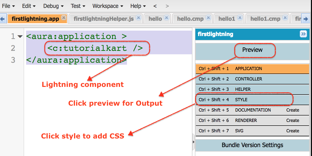
In this process, we have to add CSS to compound bundle by clicking the STYLE button in the developer console sidebar. Styling Salesforce lightning Application can be done using Salesforce Lightning Design System in Apps, using external CSS, using Join expression and styling lightning Application using design tokens.
In our previous Salesforce Tutorial, we have created Salesforce Lightning Components and created Salesforce lightning Application. Here in this tutorial, we are add background colour, borders, text colour, font size for the Salesforce Lightning app called “firstlightning.app“
- Navigate to developer console and create new lighting Component.
<aura:component >
    <h1> Welcome to Tutorialkart.com</h1>
    	<p> In this salesforce tutorials, we will learn about how to add stylling to lightning application. We have 5 salesforce user as shown below </p>
    	    <div>
    		<div class="red">Salesforce user1 - Red</div>
                <div class="green">Saleforce user2 - Green</div>
                <div class="blue">Saleforce user3 - Blue</div>
                <div class="white">Saleforce user4 - White</div>
                <div class="yellow">Saleforce user5 - Yellow</div>
            </div>

</aura:component>
Here we have created a new component called “tutorialkart”. As shown above we have inserted H1 tag for the title and used paragraph. And next we have used division using <div> tag. We have defined classed in style. So we have used classed for Salesforce user as shown above.Now go to the application that we created.
<aura:application >
    <c:tutorialkart />
</aura:application>
Now I want some background colour and border to this component. Click on Style and we can ay styling as shown above.
.THIS {
    background-color:White;
    padding-top:10px;
    margin: auto;
    width: 50%;
    border: 1px solid green;
    padding: 10px;
    font-family:Arial, Helvetica, sans-serif;
}

h1.THIS {
    font-size:30px;
    margin: auto;
    font-weight:bold;
    padding-top:10px;
    text-align: center;
}
.THIS.white {
    background-color: white;
}

.THIS .red {
    background-color: red;
}

.THIS .blue {
    background-color: blue;
}

.THIS .green {
    background-color: green;
}
.THIS .yellow {
    background-color: yellow;
}
For adding background colour we have added white, padding is 10px, margin: auto; width: 50%; border: 1px solid green; padding: 10px; font-family:Arial, Helvetica, sans-serif.
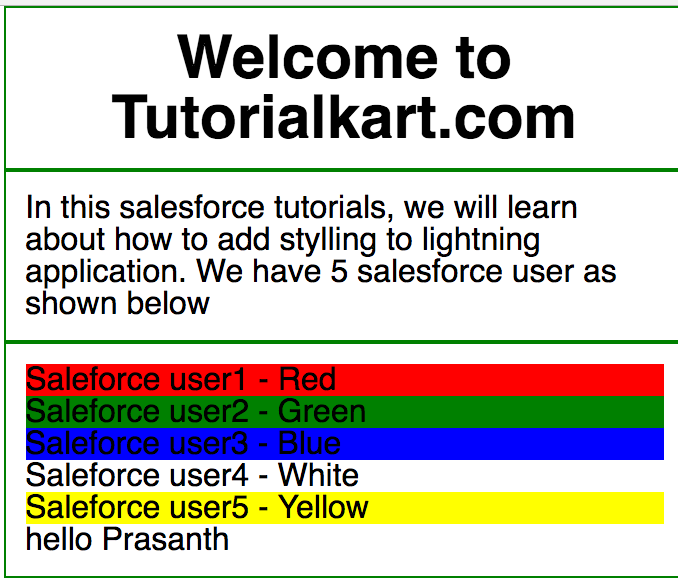
- Now click on preview button for output.

Instead of using this CSS that we defined, we can use the existing CSS from external static resource called Bootstrap. We have to download external static bootstrap style sheet and upload to Static resources in Salesforce.com.
Styling lightning Application using external static resource.
External Static resource bootstrap Style Sheets can be downloaded at developer.salesforce.com form the following http://developer.salesforce.org/bootstrap-sf1/ Download to your local system and upload to Static resources as shown below.
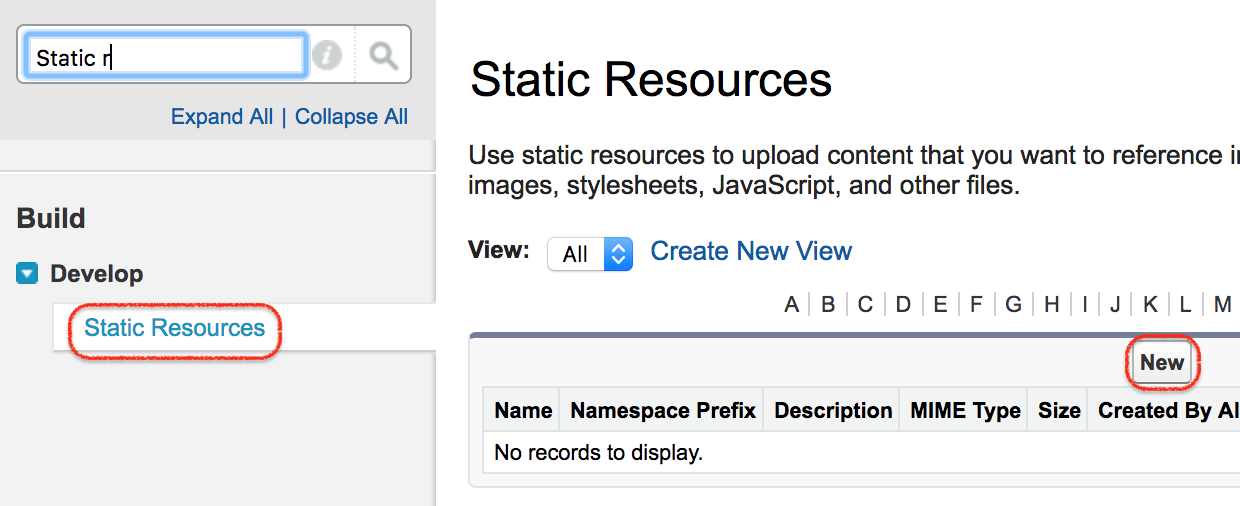
- Navigate to Setup | Build | Develop | Static resources.

- Click on New button to add new external static resources bootstrap file.

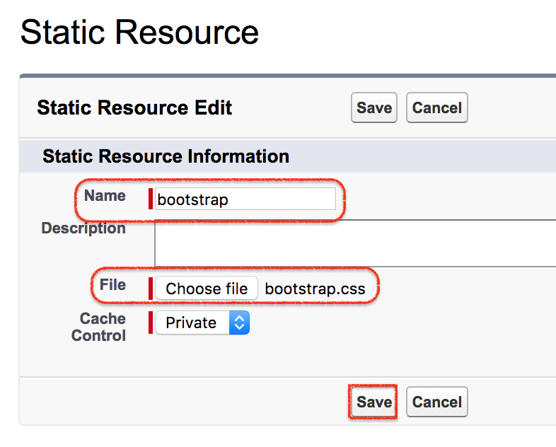
- Enter name and choose the file.
- Click on Upload button and click on Save button.
How to use bootstrap css in Salesforce lightning component.
ltng is the tag required and we have provide the resource and name of the file as shown below.

The above code is to use bootstrap style sheets.
- ltng is short form and the tag called require is used.
- Resource is the path of the file.
- Bootstrap is the name of the file.

